Key Tools of all Successful Traders

For years, technical analysis has had its critics.
They’ve argued that forecasting future price movement based on prior price movement is akin to reading the tea leaves. In fact, fundamental analysts, like Warren Buffett are quick to call technical analysis worthless.
He’s certainly entitled to his opinion.
However, what technical analysis can do better than most is help us make decisions on what to buy, sell, or hold based on the probabilities and actions of others, given specific conditions. If, for example, a pattern appears on a chart, a technician can create a framework for what the stock may do based on what traders have done.
If a stock has a history of failing at prior resistance again and again, for example the argument can be made that a retest could produce the same result the next time, too. Even if a stock could be fundamentally strong, if it’s challenging a point where it historically fails, why would I buy it at that point?
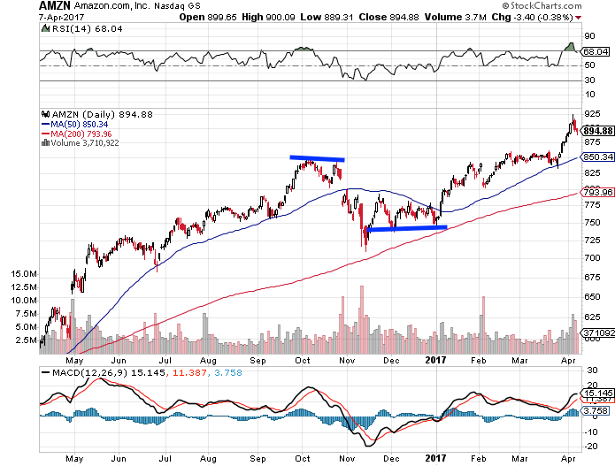
Look at Amazon.com (AMZN), for example.
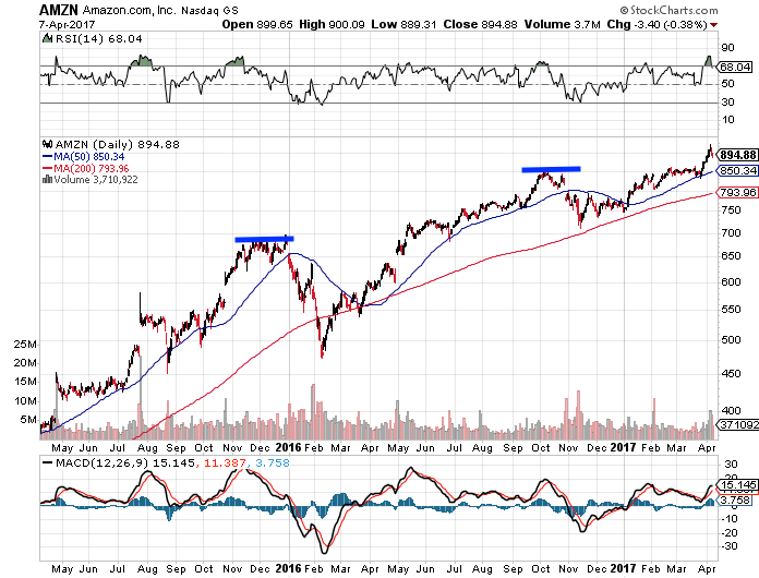
You’d have to ask yourself in September 2016, if the stock challenged that same resistance for the third time, what would I do? At the same time, had you waited, you could have traded the long side of the stock, as it caught triple bottom support.
That’s why technical analysis is as essential as fundamental analysis. It highlights where traders are heavy buyers or sellers. Why ignore that?
The Technical Theory
Chart analysis is rather easy. Let’s look at some basic, yet very powerful tools you can use on your own. While technical analysts used dozens, if not hundreds of tools, charting really boils down to seeing where the stock is currently trading and attempting to figure out where it may be going. Two, we’re attempting to understand the power of trend.
To do so, we’re looking at the following:
Trends and trend lines – There’s no big secret to finding a trend. If prices are hitting higher highs and rising lows, we have a rising trend. For example, if we examine the iShares NASDAQ Biotech ETF (IBB), we can see that it established quite a strong trend for several years.
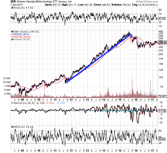
At the same time, traders are also looking for potential trend line breakouts to spot opportunity, as well. For example, using the same IBB chart above we can see that once the trend was broken in June 2016, the ETF began to shift lower. However, you’d never just short the IBB because it broke its trend line once, though. Two things can happen at that test. One, the price will bounce immediately thereafter, or it’ll continue breaking down. Wait for confirmation. Be patient.
To make your argument a bit stronger with trends is through the use of multiple time frames. Help your case by identifying what the long-trend and short-term time frames are telling you about a chart. By only looking at a six-month chart, you’re missing potential identifiable long-term information on trends.
Another reason to identify long and short-term trends is to figure out strong historical areas of support and resistance, as well.
Support and resistance points – These are simple terms that can tell us at what price levels we’re likely to see buyers (demand) or sellers (supply). We can again refer to the Amazon chart to see how well both held up, and helped determine the potential for change.
Traders will even begin to study the Fibonacci retracement levels to identify where to buy or exit a trade. Note: Retracement levels are based on the belief that stocks, currencies and indices tend to retrace their paths after a big move in a single direction.
You first find your two extremes – a peak and a trough – and then divide by key Fibonacci ratios, such as 23.6%, 38.2%, 50%, 61.8%, and 76.4%. All are used to forecast the extent of a potential pullback or move higher. Once those levels are found, we then draw our horizontal lines at each % marker to define points of support and resistance. Each plays a big role in the market to determine critical points that can send a stock back up, or back down.
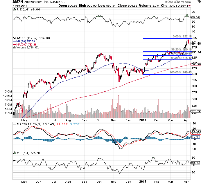
Even moving averages, such as the 50- and 200-day moving averages can help determine trend as well as strength/weakness of that trend. For example, if the 50-day moving average crosses above the 200-day, we can begin to make the argument that momentum may be shifting.
Momentum Pivots – Market participants determine strength of momentum. It helps us warn of potential pivots and help us see if we should buy or even short a stock. Some of the best ways to determine a potential momentum pivot is by looking at key indicators, such as relative strength (RSI), moving average convergence divergence (MACD) and even Money Flow. If all three agree, the momentum pivot argument can be strengthened.
For example, when relative strength dips to or below its 30-line, we have an oversold situation. We then confirm with a wild swing on MACD, as we saw on Manpower Group (MAN) in January 2016 and June 2016. Then, we can confirm again with Money Flow. When MFI dips to or below its 20-line, we have an oversold situation.
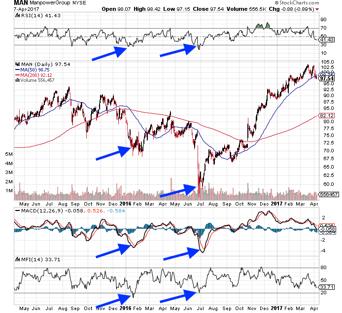
While many more indicators can be used to confirm even more, using just these three to confirm accurately called pivots in momentum.
Critics may not agree with technical analysis, but it’s been proven to be a powerful tool none of us can afford to ignore.